Part 2. Matplotlib for Data Visualization#
In this part we will use basic line plots to illustrate the fundamentals of creating plots from data, customization options, including labels and titles, and saving the plot as an image file.
2.1 Matplotlib Pyplot#
matplotlib.pyplot is a collection of functions like those in MATLAB for plotting in Python. Used in conjunction with numpy, useful visualisations of data can easily be created. As always, we start by importing the necessary libraries:
import matplotlib.pyplot as plt
import numpy as np
2.2 Line Plots#
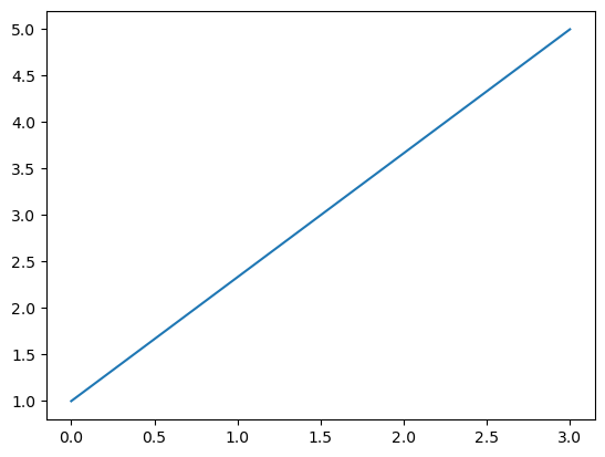
Lets create two NumPy arrays each containing the \(x\)- and \(y\)-coordinates respectively of a two points, \((0,1)\) and \((3,5)\). The plt.plot() function in Matplotlib can be used to plot the line between these two points.
x_points = np.array([0,3])
y_points = np.array([1,5])

plt.plot(x_points, y_points)    # Line plot
plt.show()
The plt.show() isn’t stricktly necessary for jupyter notebooks but is a good practice to include it in scripts. It tells Matplotlib to display the figure.
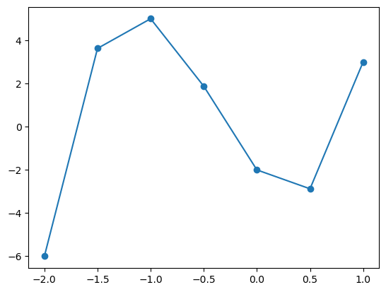
We can also plot longer arrays or coordinates and we get a line connecting each point succesively.
x_points = np.array([-9.5,0,2.0,3,10.2])
y_points = np.array([1,5,3.3,1,-2.3])

plt.plot(x_points, y_points, marker='o')  # Scatter plot
plt.show()

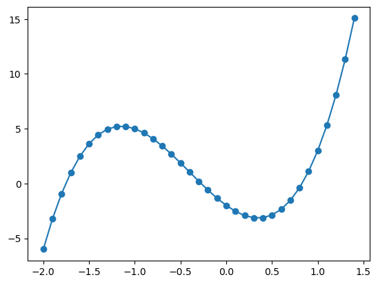
Now we can define a function that returns a polinomial and plot that using np.arange() to sample the \(x\)-axis and plug this sample into a function to get a graph of that function.
def f(x):
    '''Docstring: This returns 5x^3+6x^2-6x-2'''
    return 5*x**3 + 6*x**2 - 6*x -2

x_points_rough = np.arange(-2,1.5,.5)
y_points_rough = f(x_points_rough) # all of the operations are in f(x) are overloaded for NumPy arrays

plt.plot(x_points_rough, y_points_rough)
plt.scatter(x_points_rough, y_points_rough)
plt.show()
Here we have sampled the \(x\)-axis between \(-2\) and \(1.5\) (exluding \(1.5\)) in steps of \(0.5\). This approximates the shape of a cubic, however if we sample more frequently (for example stelps of \(0.1\) as seen below), we can achive something approximating a smooth curve.
x_points_fine = np.arange(-2,1.5,.1)
y_points_fine = f(x_points_fine)

plt.plot(x_points_fine, y_points_fine, marker='o')
plt.show()
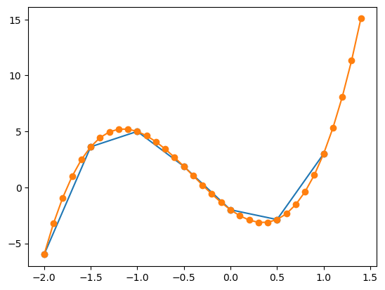
When using the same function on the same graph, matplotlib will automatically set different colours for the different plots data. Then we will have two plots on the same graph which will automatically be set to different colours. Matplotlib also automatically sets the axes limits to fit all the data.
For colouring matching when using multiple functions to represent the data, an important note is that the order matters. The first function plotted will be the first colour in the colour cycle, the second function plotted will be the second colour in the colour cycle and so on.
# Two Line plots on the same graph
plt.plot(x_points_rough, y_points_rough, marker='o')
plt.plot(x_points_fine, y_points_fine, marker='o')

plt.show()
We can also graph multiple plots in the same plt.plot() call by passing in multiple x and y arrays (but in this case it only works for line plots):
Syntax: plt.plot(x1, y1, x2, y2, ...)
plt.plot(x_points_rough, y_points_rough, x_points_fine, y_points_fine, marker='o')
plt.show()
# Another way to plot multiple plots in the same graph
plt.plot(
    x_points_rough, y_points_rough,
    x_points_fine, y_points_fine)
plt.show()

2.2.1 Lines#
In the following section we will look at ways of formatting lines in our plots. We will use the following data during the demonstration.
# Generating some data
x = np.arange(0,1,.05)
# Computing exponential functionso
ex = np.exp(x)
e2x = np.exp(2*x)
e3x = np.exp(3*x)
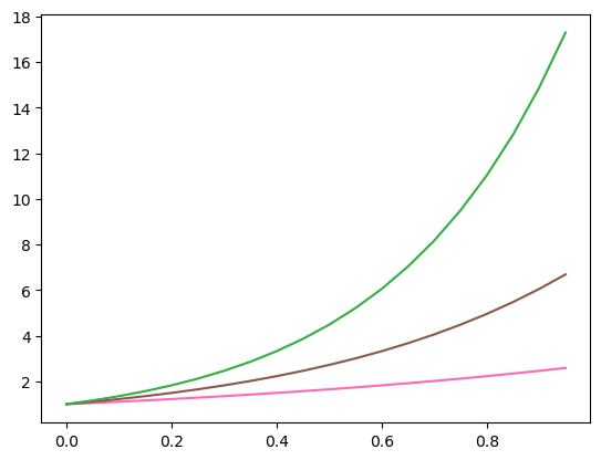
2.2.2 Colour#
To specify the colour of a line we can use the color or c, keyword when calling plt.plot(). We can use the following named colours (sourced here) or specify a Hex Color Code.


x = np.arange(0,1,.05)
ex = np.exp(x)
e2x = np.exp(2*x)
e3x = np.exp(3*x)
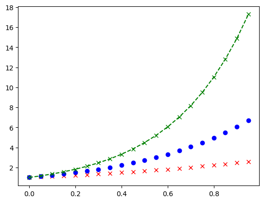
plt.plot(x, ex, c = 'hotpink')
plt.plot(x, e2x, color = 'tab:brown')
plt.plot(x, e3x, '#31AF3F')
plt.show()
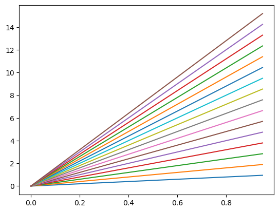
If no colour is specified the ‘Tableau Palette’ will be cycled through as seen below
plt.plot(
    x, x,
    x, 2*x,
    x, 3*x,
    x, 4*x,
    x, 5*x,
    x, 6*x,
    x, 7*x,
    x, 8*x,
    x, 9*x,
    x, 10*x,
    x, 11*x,
    x, 12*x,
    x, 13*x,
    x, 14*x,
    x, 15*x,
    x, 16*x)
plt.show()
Short exercise: Plot the functions \(y=\sin(x)\) and \(y=\cos(x)\) on the same graph for \(x\) values ranging from \(0\) to \(2\pi\). Use read and blue for each function. You can use np.linspace to generate the \(x\) values.
Example here!
import numpy as np
import matplotlib.pyplot as plt

x = np.linspace(0, 2*np.pi, 100)
y1 = np.sin(x)
y2 = np.cos(x)

plt.plot(x, y1, color='blue')
plt.plot(x, y2, color='red')

plt.show()
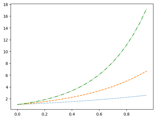
2.2.3 Width#
The line width can be specified with the keyword linewidth or lw and has default value of 1.
plt.plot(x, ex, lw = '1.5')
plt.plot(x, e2x, linewidth = '2.8')
plt.plot(x, e3x, lw = '10')
plt.show()

2.2.4 Line style#
plt.plot(x, ex, linestyle = ':')
plt.plot(x, e2x, ls = 'dashed')
plt.plot(x, e3x, '-.')
plt.show()
The 'None' line style might seem pointless but it can be used when only the point markers are needed which we will seen next. A more complete description of the line style formatting options can be found here.
Short exercise: Using the same example from prev. exercise, now change the line width of the plots to 2, and one of the lines to a dashed style.
Example here!
import numpy as np
import matplotlib.pyplot as plt

x = np.linspace(0, 2*np.pi, 100)
y1 = np.sin(x)
y2 = np.cos(x)

plt.plot(x, y1, color='blue', linewidth=2, linestyle='--')
plt.plot(x, y2, color='red', linewidth=2)

plt.show()
2.2.5 Marker Types#
A marker type can be specified in a similar way to line styles with the keyword 'marker'. A list of the marker types can be found here. When the marker type specified without a keyword the the line style defaults to 'None' showing only the data points without the connecting lines.
x = np.arange(0,1,.05)

plt.plot(x, ex, '.') # dots
plt.plot(x, e2x, marker = '*') # stars
plt.plot(x, e3x, marker = '$hi$', ls = 'None')
plt.show()

I should note that the keyword markerfacecolor and markersize exist and they do as you might expect. I will further note that we can assign colour and marker in a single compact form as seen below. This is useful for quick assignment but might get confusing and/or limit customisability.
plt.plot(x, ex, 'rx', x, e2x, 'bo', x, e3x, 'g--x')
plt.show()
2.2.6 Axes#
Limits#
We have seen above that the size of our graph changes and rescales. You can set the \(x\)- and \(y\)-axis limit with plt.xlim() and plt.ylim() as shown.
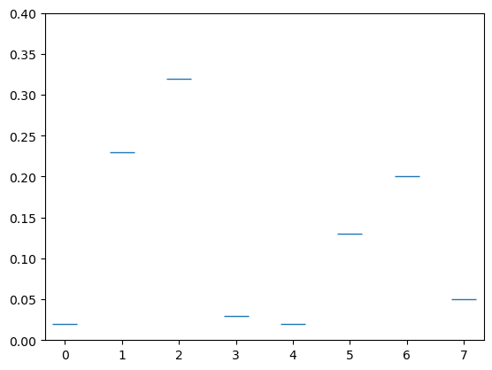
qbits = [0,1,2,3,4,5,6,7]
probs = [.02,.23,.32,.03,.02,.13,.2,.05]

plt.plot(qbits,probs,'_',markersize = 20)
plt.ylim([0,.4])
plt.show()
Ticks#
We can reformat the \(x\) and \(y\) ticks in the following way.
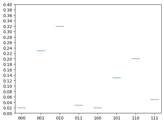
x_ticks = [0,1,2,3,4,5,6,7]
y_ticks = np.arange(0,1,.02)
x_labels = ['000','001','010','011','100','101','110','111']

plt.plot(qbits, probs, '_', markersize = 20)
plt.xticks(ticks=x_ticks, labels=x_labels)
plt.yticks(ticks=y_ticks)
plt.ylim([0,.4])
plt.show()
This effect is however better achieved by a histagram or bar chart that we will look at later.
2.2.7 Grid#
Often the clarity of demonstrating the values of the points can be assisted by adding a grid of horizontal and verticle lines stretching from the ticks. This can be toggled on/off using plt.grid().
plt.plot(qbits,probs,'o')
plt.grid()
plt.show()

2.2.8 Labels#
Lables are a great way to explain what it is your are plotting. In the strings used to label a lot of \(\LaTeX\) is supported which can be very useful.
Title#
A title string can be added using plt.title().
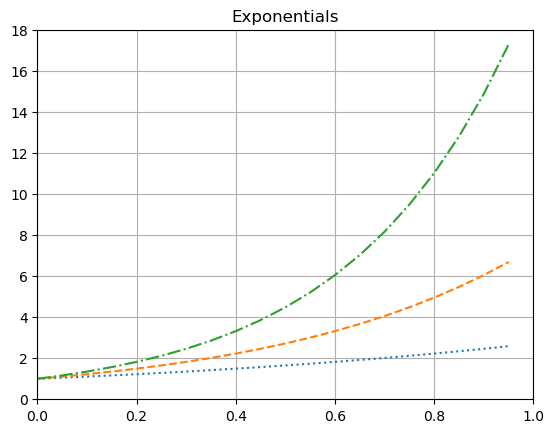
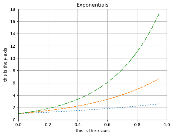
plt.plot(x, ex, ':')
plt.plot(x, e2x, '--')
plt.plot(x, e3x, '-.')

plt.title('Exponentials')

plt.xlim([0,1])
plt.ylim([0,18])

plt.grid()

plt.show()
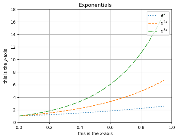
Axis Lables#
Similarly, plt.xlabel() and plt.ylabel() can be used to add labels to the \(x\)- and \(y\)-axes respectively.
plt.plot(x, ex, ':')
plt.plot(x, e2x, '--')
plt.plot(x, e3x, '-.')

plt.title('Exponentials')
plt.xlabel('this is the $x$-axis')
plt.ylabel('this is the $y$-axis')

plt.xlim([0,1])
plt.ylim([0,18])

plt.grid()

plt.show()
2.2.9 Legends#
In plt.plot() we can assign a name to what is being plotted using the label keyword. A legend displaying this can then be toggled on/off using plt.legend() with keyword loc to set a location.
plt.plot(x, ex, ':', label = '$e^x$')
plt.plot(x, e2x, '--', label = '$e^{2x}$')
plt.plot(x, e3x, '-.', label = '$e^{3x}$')

plt.title('Exponentials')
plt.xlabel('this is the $x$-axis')
plt.ylabel('this is the $y$-axis')

plt.xlim([0,1])
plt.ylim([0,18])

plt.grid()
plt.legend(loc = 'upper right')

plt.show()
Short exercise: Plot the functions \(y=\sin(x)\) and \(y=\cos(x)\) on the same graph for \(x\) values ranging from \(0\) to \(2\pi\). Now add a legend to the plot, axis labels, a title and grid in grey.
Example here!
import numpy as np
import matplotlib.pyplot as plt

x = np.linspace(0, 2*np.pi, 100)
y1 = np.sin(x)
y2 = np.cos(x)

plt.plot(x, y1, color='blue', linewidth=2, linestyle='--', label='sin(x)') # Note that we need to add a label here
plt.plot(x, y2, color='red', linewidth=2, label='cos(x)') # also here

plt.title('Plot of sin(x) and cos(x)')
plt.xlabel('x values')
plt.ylabel('y values')
plt.grid(color='grey')
plt.legend()

plt.show()
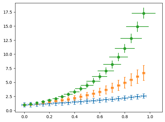
2.2.10 Error Bars#
If we call plt.errorbar() instead of plt.plot() we can add error bars in the \(x\) and \(y\) directions by specifying either a constant error or a list as the xerr and yerr. These error bars can be formatted in various ways as shown with capsize and here.
plt.errorbar(x, ex, ls = 'None',  marker = '.', xerr=.02, yerr=.4, capsize = 3)
plt.errorbar(x, e2x, ls = 'None', marker = 'x', xerr=.01, yerr=.2*e2x, capsize = 2)
plt.errorbar(x, e3x, ls = 'None', marker = 'o', xerr=x/10, yerr=x, capsize = 0)
plt.show()
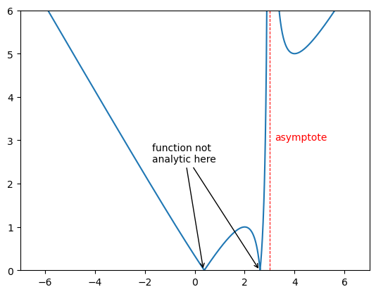
2.2.11 Asymptotes and Annotations#
Verticle and horizontal lines can be added using plt.vlines() and plt.hlines which takes in the value the line is at and the begining and end of the line as arugaments as shown. One can also have an array of vales for this which will give many lines.
The function annotate plt.annotate() is ver useful when you want to draw attention to a particular point in your plot. It takes in a string that will be displayed and the point you are interested in. One can change the text colour as you might expect by calling the c keyword. The text can be put at different point to the point of intrest using xytext and an arrow can be generated between using arrowprops and giving a dictionary that will specify the features as shown.
xs = np.arange(-7,7,.01)
ys = np.abs(xs - 1/(3-xs))

plt.xlim([-7,7])
plt.ylim([0,6])


plt.plot(xs,ys)

plt.vlines(3,0,10,color='r',ls='dashed',lw=.8)


plt.annotate('asymptote',(3.2,3),c='r')
plt.annotate('function not\nanalytic here',(2.6,0),c='w',xytext=(-1.7,2.5),arrowprops={'arrowstyle':'->', 'lw':1})
plt.annotate('function not\nanalytic here',(.35,0),xytext=(-1.7,2.5),arrowprops=dict(arrowstyle='->',lw=1))

plt.show()
Short exercise: Plot the functions \(y=\sin(x)\) and \(y=\cos(x)\) on the same graph for \(x\) values ranging from \(0\) to \(2\pi\). Now add an asymptote at \(y=0.27\) in red and \(x=2.3\) in green and annotate the point where \(y=\sin(x)\) has its maximum value.
Example here!
x = np.linspace(0, 2*np.pi, 100)
y1 = np.sin(x)
y2 = np.cos(x)

plt.plot(x, y1, color='blue', linewidth=2, linestyle='--', label='sin(x)')
plt.plot(x, y2, color='red', linewidth=2, label='cos(x)')

plt.title('Plot of sin(x) and cos(x)')
plt.xlabel('x values')
plt.ylabel('y values')
plt.grid(color='grey')
plt.legend()

# Note the different methodsds for x and y asymptotes
# Adding an asymptote at y=0.25
plt.axhline(0.27, color='red', lw=0.5)
# Adding an asymptote at x=2
plt.axvline(2.3, color='green', lw=0.5)

# Annotating the maximum point of sin(x)
plt.annotate('Max', xy=(np.pi/2, 1), xytext=(np.pi/2, 1.1),
             arrowprops=dict(facecolor='black', shrink=0.01))
plt.legend()
plt.show()
2.2.12 Log Plot#
Very often data is better displayed using logarithmic scaling on the axes.
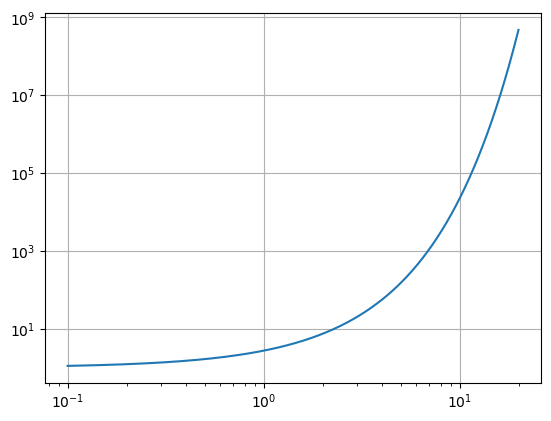
Log-log plot, plt.loglog(x,y)#
One can make a log-log plot using plt.loglog() in the place of plt.plot(). This will set both axes to logarithmic scale.
x = np.arange(0.1,20,.01)
y = np.exp(x)

plt.loglog(x,y)
plt.grid()
plt.show()
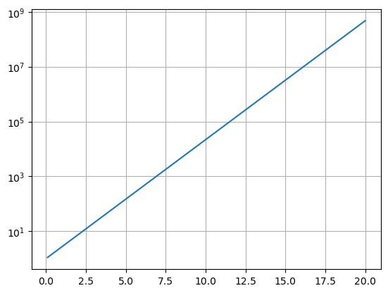
Semi-log plot, plt.semilogx() or plt.semilogy()#
We can also scale just one axis with a log scaling by using plt.semilogx() or plt.semilogy().
x = np.arange(0.1,20,.01)
y = np.exp(x)

plt.semilogy(x,y)
plt.grid()
plt.show()
x = np.arange(0.1,20,.01)
y = np.log(x)

plt.semilogx(x,y)
plt.grid()
plt.show()

Log scale and more, plt.yscale(‘log’) and plt.xscale(‘log’)#
Or we can use the plt.yscale('log') or plt.xscale('log') to set the scale of one axis to logarithmic. This is useful if you have already made a plot and then decide you want to change the scale of one axis.
Also this functions allow you to set the scale to ‘linear’, ‘log’, ‘symlog’ or ‘logit’.
Short exercise: Plot the functions \(y=\sin(x)\) and \(y=\cos(x)\) on the same graph for \(x\) values ranging from \(0\) to \(2\pi\). Try to use a log scale on the \(y\)-axis, with the different methods.
Example here!
x = np.linspace(0, 2*np.pi, 100)
y1 = np.sin(x)
y2 = np.cos(x)
plt.plot(x, y1, color='blue', linewidth=2, linestyle='--', label='sin(x)') # Note that we need to add a label here
plt.plot(x, y2, color='red', linewidth=2, label='cos(x)') # also here

plt.title('Plot of sin(x) and cos(x)')
plt.xlabel('x values')
plt.ylabel('y values')
plt.grid(color='grey')
plt.legend()

# Note the different methodsds for x and y asymptotes
# Adding an asymptote at y=0.25
plt.axhline(0.27, color='red', lw=0.5)
# Adding an asymptote at x=2
plt.axvline(2.3, color='green', lw=0.5)


# Annotating the maximum point of sin(x)
plt.annotate('Max', xy=(np.pi/2, 1), xytext=(np.pi/2, 1.1),
             arrowprops=dict(facecolor='black'))

plt.plot(x, y1, label='sin(x)')
plt.plot(x, y2, label='cos(x)')
plt.yscale('log')
plt.legend()
plt.show()
2.3 Figure Object#
So far we have been plotting without looking into what objects we have been creating in our plots. This is fine when we only want to get a quick look at our data. However, when we want to create more complex plots with multiple subplots and more customisation we need to understand the figure object and axes objects that are created when we plot.
Matplotlib allows to create a figure object using the plt.figure() function. By using this method we can specify the figure dimensions in inches as a tupple using the figsize keyword.
Then we will need to add a set of axes to this figure using the .add_axes() attribute funtion of the figure. This function takes in the argument of a list that specifies things about our axes. The list elements are taken as the [left, bottom, width, height] as fractions of the size height an width.
fig = plt.figure(figsize=(9,4))
ax = fig.add_axes([0.1,0.1,.8,.8]) # this refers to the left, bottom, width and height of the axes

# or another compact way to do this is using plt.subplots()
fig, ax = plt.subplots(figsize=(9,4))
# we can also name the different figure and axes objects
fig1, ax1 = plt.subplots(figsize=(9,4))
fig2, ax2 = plt.subplots(figsize=(9,4))
fig3, ax3 = plt.subplots(figsize=(9,4))
We can then plot on this set of axes, now using the attribute of the axis we can plot in a similar way.
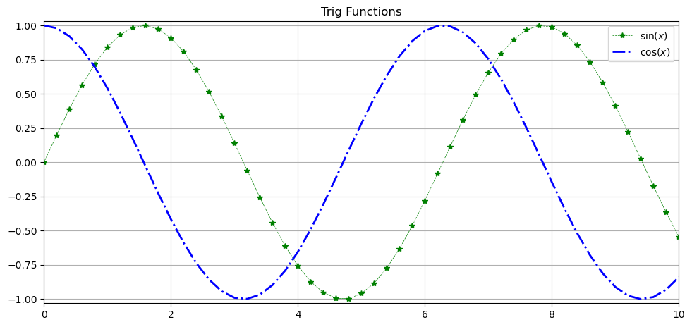
fig = plt.figure(figsize=(9,4))
ax = fig.add_axes([0,0,1,1])

x = np.arange(0,10.2,.2)
ax.plot(x, np.sin(x), c='green', lw=.5, ls='--', marker='*', label='$\sin(x)$')
ax.plot(x, np.cos(x), c='blue', lw=2, ls='-.', label='$\cos(x)$')

ax.set_xlim(0,10)
ax.set_ylim(-1.03,1.03)
ax.set_title('Trig Functions')

ax.legend()
ax.grid()
Many of the functions act the same as before but now they are attributes of the axis object and have set_ before them.
Saving the figure#
We can also not save this image. This is done using the plt.savefig() function. The file type is inferred from the file extension given. Some of the options for saving are ‘png’, ‘jpg’, ‘svg’, ‘pdf’ and ‘eps’. The dpi (dots per inch) can be set using the dpi keyword, the default is 100. A higher dpi will give a higher resolution image but also a larger file size.
fig.savefig('my_figure.png', dpi=300)
Note about the path: If you do not specify a path, the image will be saved in the current working directory. You can specify a different path by providing the full path in the filename,
Example:
# note we are calling the object
fig.savefig('/path/to/directory/my_figure.png', dpi=300)
Make sure that the directory exists, as Matplotlib will not create it for you.
Exercise: Using the figure and axis object method, recreate the plot of \(y=\sin(x)\) and \(y=\cos(x)\) on the same graph for \(x\) values ranging from \(0\) to \(2\pi\). Add an asymptote at \(y=0.27\) in red and \(x=2.3\) in green and annotate the point where \(y=\sin(x)\) has its maximum value. Add a legend to the plot, axis labels, a title and grid in grey. Finally save the figure as a png file with a dpi of 300.
Example here!
fig, ax = plt.subplots(figsize=(9,4))
x = np.linspace(0, 2*np.pi, 100)
y1 = np.sin(x)
y2 = np.cos(x)
ax.plot(x, y1, color='blue', linewidth=2, linestyle='--', label='sin(x)')
ax.plot(x, y2, color='red', linewidth=2, label='cos(x)')
ax.set_title('Plot of sin(x) and cos(x)')
ax.set_xlabel('x values')
ax.set_ylabel('y values')
ax.grid(color='grey')
ax.legend()

# Adding an asymptote at y=0.25
ax.axhline(0.27, color='red', lw=0.5)

# Adding an asymptote at x=2
ax.axvline(2.3, color='green', lw=0.5)

# Annotating the maximum point of sin(x)
ax.annotate('Max', xy=(np.pi/2, 1), xytext=(np.pi/2, 1.1),
             arrowprops=dict(facecolor='black'))

ax.legend()

fig.savefig('figure1.png', dpi=300)
plt.show()
2.4 Multiple and Alternative Plots#
import matplotlib.pyplot as plt
import numpy as np
2.4.1 Making sub-plots using plt.subplot()#
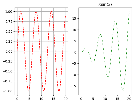
Making multiple plots can often be very useful. There are a number of ways to do this, prehaps the quickest is using plt.subplot(). The first two arguments are defining the grid shape (row then column) and the third will be the number within this grid, counting horizontally before vertical as shown. After we have specified the plot we can use the familiar functions we are used to like plt.plot, plt.titles, etc. The function plt.suptitle() can be used to give a title to the entire figure.
x = np.arange(0,20,.03)

plt.suptitle('Lots of Plots')

plt.subplot(221) # (rows, columns, panel number starts at 1)
plt.plot(x, np.sin(x), 'r--')
plt.title('Plot 1')
plt.grid()

plt.subplot(2,2,2) # (rows, columns, panel number)
plt.plot(x, x*np.sin(x), 'g:')
plt.title('$x\ sin(x)$')

plt.subplot(223) # (rows, columns, panel number)
plt.plot(x, -np.sin(x), 'b-')
plt.xlabel('time')
plt.ylabel('distance')

plt.subplot(224) # (rows, columns, panel number)
plt.plot(x, -np.sin(x**2), 'k,')
plt.xlim([0,5])

plt.show()

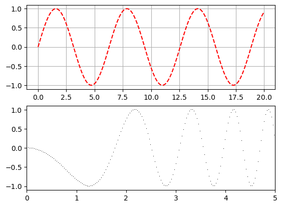
x = np.arange(0,20,.03)

plt.subplot(1,2,1)
plt.plot(x, np.sin(x), 'r--')
plt.grid()

plt.subplot(1,2,2)
plt.plot(x, x*np.sin(x), 'g:');
plt.title('$x \sin(x)$')

plt.show()
x = np.arange(0,20,.03)

plt.subplot(2,1,1)
plt.plot(x, np.sin(x), 'r--')
plt.grid()

plt.subplot(2,1,2)
plt.plot(x, -np.sin(x**2), 'k,');
plt.xlim([0,5])

plt.show()
Short exercise on subplots: Create a figure with 4 subplots, each displaying a different function of \(x\) (e.g., \(y=\sin(x)\), \(y=\cos(x)\), \(y=x\sin(x)\), and \(y=-\sin(x^2)\)) using the plt.subplot() function.
Example here!
x = np.linspace(0, 5, 100)

plt.figure(figsize=(9,6))
plt.suptitle('Panel of Plots')
plt.subplot(221) # (rows, columns, panel number starts at 1)
plt.plot(x, np.sin(x), 'r--')
plt.title('Plot 1')
plt.grid()

plt.subplot(2,2,2) # (rows, columns, panel number)
plt.plot(x, x*np.sin(x), 'g:')
plt.title('$x\ sin(x)$')
plt.grid()

plt.subplot(223) # (rows, columns, panel number)
plt.plot(x, -np.sin(x), 'b-')
plt.xlabel('time')
plt.ylabel('distance')
plt.grid()

plt.subplot(224) # (rows, columns, panel number)
plt.plot(x, -np.sin(x**2), 'k,')
plt.xlim([0,5])
plt.title('$-\ sin(x^2)$')
plt.grid()

# extra
plt.tight_layout() # this adjusts the subplots to fit in the figure area.
plt.show()
2.4.2 Plots in Plots#
The above method is indeed very quick and but it is better to create a figure. After this we can simply create two sets of axes. The function fig.suptitle() can be used to give a title to the entire figure.
fig = plt.figure(figsize=(10,4))

x = np.arange(.01,10,.01)
y = 1/x + .2*np.exp(-((x*3-22)**2))

fig.suptitle('Plots',size=20)

ax1 = fig.add_axes([0,0,.45,.8])
ax1.plot(x,y)
ax1.set_xlim(0,10)
ax1.set_ylim(0,10)

ax2 = fig.add_axes([0.55, 0, 0.45, .8])
ax2.plot(x,y)
ax2.set_xlim(6.4,8)
ax2.set_ylim(0,.4)

ax1.set_title('Zoomed Out')
ax2.set_title('Zoomed In')

plt.show()
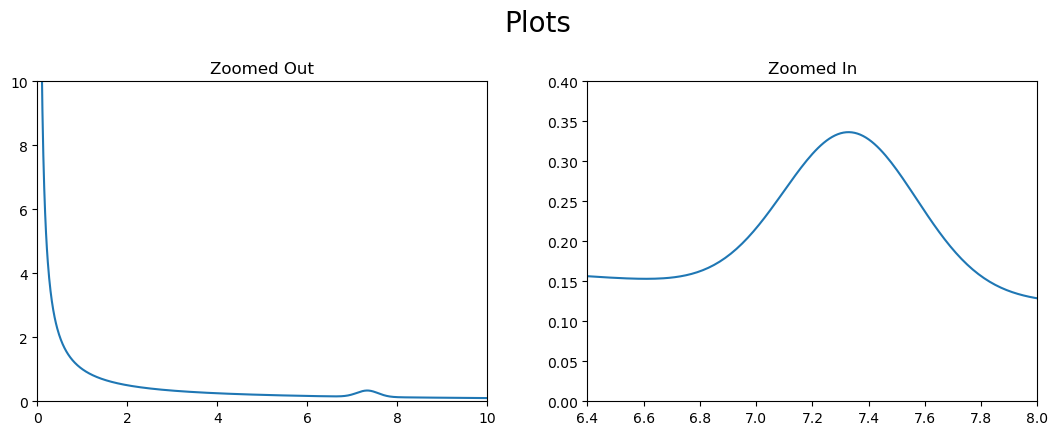
This method is particularly useful when we want to create a plot within another plot.
fig = plt.figure(figsize=(5,4))

x = np.arange(.01,10,.01)
y = 1/x + .2*np.exp(-((x*3-22)**2))

ax1 = fig.add_axes([0,0,1,1])
ax1.plot(x,y)
ax1.set_xlim(0,10)
ax1.set_ylim(0,10)

ax2 = fig.add_axes([0.55, 0.55, 0.4, 0.4])
ax2.plot(x,y)
ax2.set_xlim(6.5,8)
ax2.set_ylim(0,.4)

plt.show()

2.4.3 Making sub-plots using fig.add_subplot()#
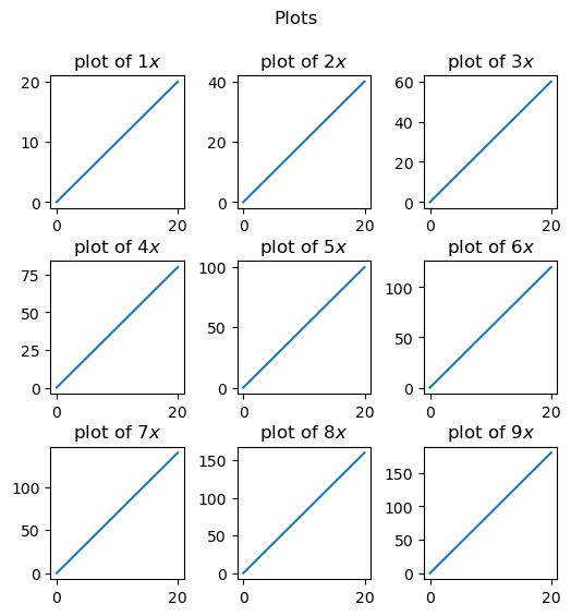
While repeatedly adding axes to the figure does give a lot of control, specifying placement for a large number of plots could become laborious. The function fig.add_subplot() can become very useful for this particulary for iterative creation of plots. fig.subplots_adjust() is often necessary to spread the plots out.
x = np.arange(0,20,.03)

fig = plt.figure(figsize = (6,6))
fig.subplots_adjust(hspace=0.4, wspace=0.4)
fig.suptitle('Plots')

for i in range(1, 10):
    ax = fig.add_subplot(3, 3, i)
    ax.set_title('plot of $' + str(i) + 'x$')
    ax.plot(x,i*x)

plt.show()
Exercise: Create a 3x3 grid of subplots where each subplot is a plot of \(e^{ix}\) for i=1,…,9. Add titles to each subplot and a main title to the figure. Adjust the spacing between the subplots so that the titles do not overlap with other subplots.
Example here!
fig = plt.figure(figsize=(9,9))
fig.suptitle('3x3 grid of plots of $e^{ix}$', fontsize=16)

for i in range(1,10):
    ax = fig.add_subplot(3,3,i) # (rows, columns, panel number)
    x = np.linspace(0, 2*np.pi, 100)
    y = np.exp(1j*i*x)
    ax.plot(x, y.real, label='Real part')
    ax.plot(x, y.imag, label='Imaginary part')
    ax.set_title(f'$e^{{i{i}x}}$')
    ax.legend()

fig.subplots_adjust(hspace=0.5, wspace=0.3) # adjust spacing
plt.show()
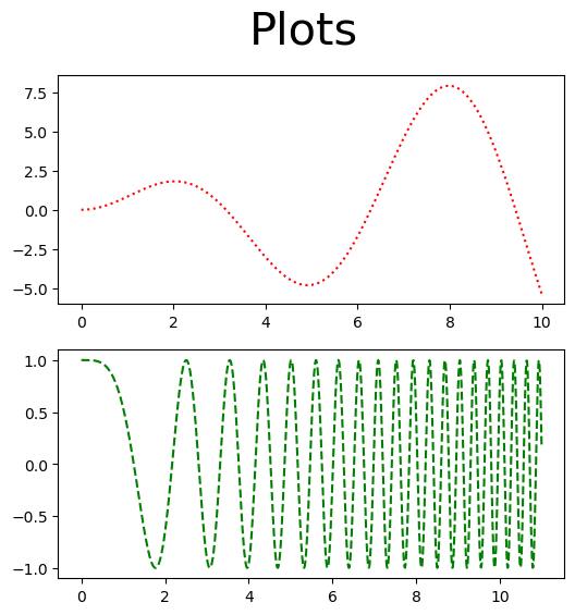
2.4.4 Making sub-plots using plt.subplots()#
Another method of having the acheving a similar but prehaps more versitile result is to first make an empty figure object using plt.subplots() to create a figure object and a tupple of axes within that. As seen below plt.subplots() returns both a figure, fig and a numpy array of axes, ax. Within plt.subplots() one can specify the number and shape of axes with ax; e.g plt.subplots(2,1) creates a figure with two rows with one set axes each.
fig, ax = plt.subplots(2,1, figsize=(6,6))

x1 = np.arange(0,10,.01)
x2 = np.arange(0,11,.01)

fig.suptitle('Plots', size = 30)
ax[0].plot(x1, x1*np.sin(x1), 'r:')
ax[1].plot(x2, np.cos(x2**2), 'g--')

plt.show()
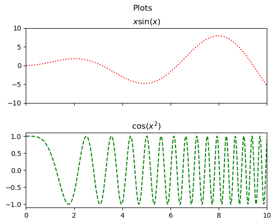
It would be nice if these plots lined up and shared a \(x\)-axis for ease of comparison. This is easily done by setting sharex=True when creating the figure. Setting the limit on one of the shared axes will obviously change the limit for the other.
fig,ax = plt.subplots(2,1,sharex=True)

fig.subplots_adjust(hspace=0.4, wspace=0.4)

x1 = np.arange(0,10,.01)
x2 = np.arange(0,11,.01)

fig.suptitle('Plots')
ax[0].plot(x1,x1*np.sin(x1),'r:')
ax[0].set_title('$x\sin(x)$')
ax[0].set_ylim([-10,10])

ax[1].plot(x2,np.cos(x2**2),'g--')
ax[1].set_title('$\cos(x^2)$')
ax[1].set_xlim([0,10])

plt.show()
We can easily share both axes too in a square grid.
fig,ax = plt.subplots(2,2,sharex=True,sharey=True)

fig.subplots_adjust(hspace=0.4, wspace=0.1)

x = np.arange(0,5,.01)

fig.suptitle('Trig Plots',size=15)
ax[0][0].plot(x,x*np.sin(x),'r:')
ax[0][0].set_title('$x\ \sin(x)$')
ax[0][0].set_ylim([-5,5])

ax[1][0].plot(x,x*np.cos(x),'g--')
ax[1][0].set_title('$x\ \cos(x^2)$')
ax[1][0].set_xlim([0,5])

ax[0][1].plot(x,5*np.sin(x**2),'b-.')
ax[0][1].set_title('$5\ \sin(x^2)$')
ax[0][1].set_xlim([0,5])

ax[1][1].plot(x,5*np.cos(x**2),'k')
ax[1][1].set_title('$5\ \cos(x^2)$')
ax[1][1].set_xlim([0,5])

plt.show()

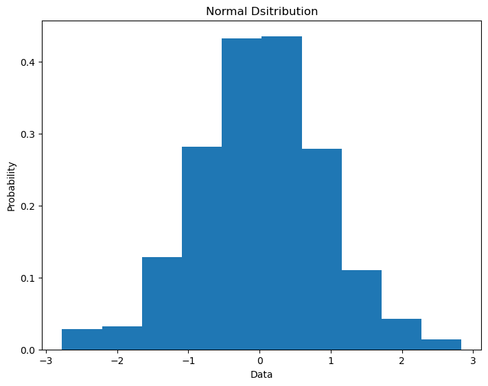
2.4.5 Histogram#
Histograms can be very useful in exploring qubit output probabilities in quantum computing so they are worth taling note of. The function plt.hist() takes in an array of values. You can specify the number intervals over which the data is sampled with the bins keyword. What is plotted is either the counts or the percentage of counts (depedning on the density keyword) presenting the array in that interval.
data = np.random.normal(0.0,1.0,500)

fig = plt.figure()
ax = fig.add_axes([0,0,1,1])

ax.hist(data, density=True, bins=10)
ax.set_title('Normal Dsitribution')
ax.set_ylabel('Probability')
ax.set_xlabel('Data')

plt.show()
There are some other costomizability options for plots that are very useful in histograms.
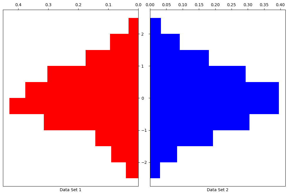
.invert_xaxis()and.invert_yaxis(): Flips either axis..xaxis.tick_top()and.yaxis.tick_right(): Changes side ticks appear on..get_shared_x_axes().join(ax1, ax2)and.get_shared_y_axes().join(ax1, ax2): Creates a link between the two axes so that they scale together. This is useful if the axes have been created seperately byfig.add_axes()as opposed to and subplot technique. Theorientationkeyword can be changed to'horizontal'to flip the chart on its side.
data1 = np.random.normal(0.0,1.0,500)
data2 = np.random.normal(0.0,1.0,5000)

bin_array = np.arange(-2.5,3,.5)

fig = plt.figure(figsize = (10,6))

ax1 = fig.add_axes([0,.5,.46,1])
ax1.hist(data1, density=True, bins=bin_array, color='r', orientation='horizontal')
ax1.set_xlabel('Data Set 1')

ax2 = fig.add_axes([.5,.5,.46,1])
ax2.hist(data2, density=True, bins=bin_array, color='b', orientation='horizontal')
ax2.set_xlabel('Data Set 2')

ax2.xaxis.tick_top()
ax1.xaxis.tick_top()
ax1.yaxis.tick_right()

ax1.invert_xaxis()
ax2.set_yticklabels([])

plt.show()
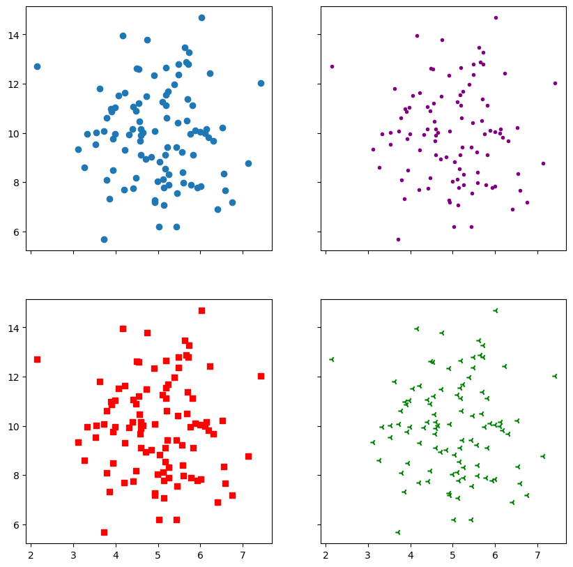
2.4.6 Scatter#
We have seen plt.plot() where you remove the lines between the points but prehaps a better way of diaplaying the same thing is using plt.scatter().
x = np.random.normal(5.0, 1.0, 100)
y = np.random.normal(10.0, 2.0, 100)

fig,ax = plt.subplots(2, 2, figsize = (10,10),sharex=True, sharey=True)

ax[0,0].scatter(x, y)
ax[0,1].scatter(x, y, color = 'purple', marker = '.')
ax[1,0].scatter(x, y, color = 'r', marker = ',')
ax[1,1].scatter(x, y, color = 'green', marker = '3')

plt.show()
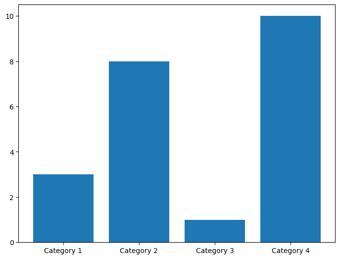
2.4.7 Bar Chart#
\(x\)-axis bar charts can be created using plt.bar(). This takes in an array of labels and an array of values for the labeled bars to take.
categories = np.array(["Category 1", "Category 2", "Category 3", "Category 4"])
values = np.array([3, 8, 1, 10])

fig = plt.figure()
ax = fig.add_axes([0,0,1,1])

ax.bar(categories,values)

plt.show()
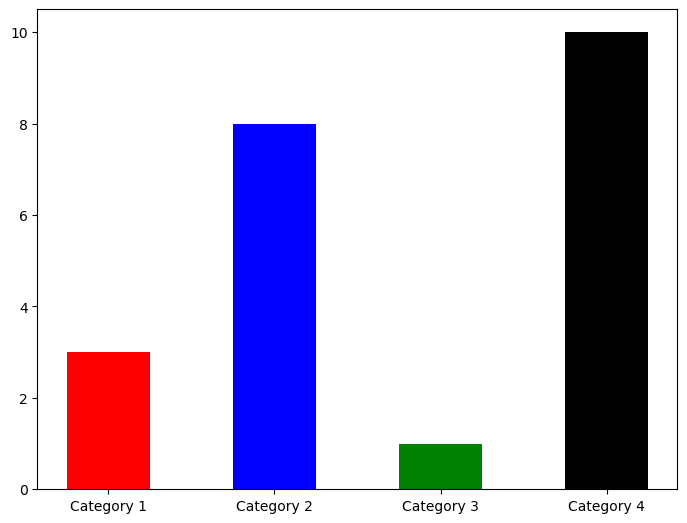
Their appearence can be changed using the color and width keywords among others.
colours = ['r','b','g','k']

fig = plt.figure()
ax = fig.add_axes([0,0,1,1])

ax.bar(categories,values,width=0.5,color=colours)

plt.show()
\(y\)-axis bar charts can be created using plt.barh().
fig = plt.figure()
ax = fig.add_axes([0,0,1,1])

ax.barh(categories,values,height=0.1,color='r')

plt.show()

2.4.8 Pie Chart#
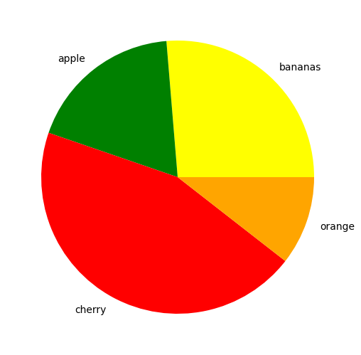
The function plt.pie() is used similarly to plt.bar() to create a pie chart. The proportions, labels and colors are specified.
nums=[10,7,17,4]
fruits=['bananas','apple','cherry','orange']
fruit_colours=['yellow','green','red','orange']

fig = plt.figure()
ax = fig.add_axes([0,0,1,1])

ax.pie(nums, labels=fruits, colors=fruit_colours)

plt.show()
Using the explode keyword we can highlight and seperate the segments. This is set to a list or numpy array with the same length as the number of segments that sets how seperated each segment is.
fruit_explosion=[0,0.2,0,.5]

fig = plt.figure()
ax = fig.add_axes([0,0,1,1])

ax.pie(nums, labels=fruits, colors=fruit_colours, explode=fruit_explosion)

plt.show()
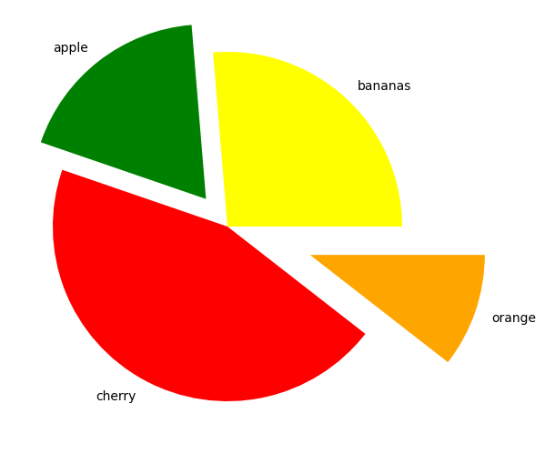
fig = plt.figure()
ax = fig.add_axes([0,0,1,1])
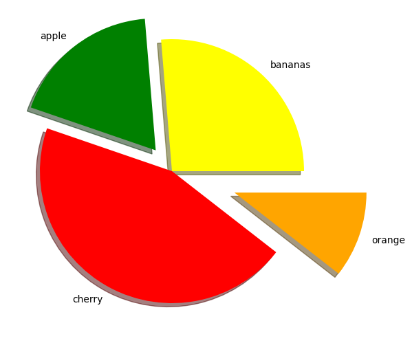
ax.pie(nums, labels=fruits, colors=fruit_colours, explode=fruit_explosion, shadow = True)
plt.show()
2.5 3D plots and animations#
import numpy as np
import matplotlib.pyplot as plt
2.5.1 3D Line Plot#
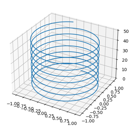
To make a 3D plot you must first create a set of axes with the keyword projection set to '3d'. Then we can populate it with a line using the .plot3D() attribute function of the axes object. This is similar to plt.plot(), only now it will have three instead of two array argumanets.
fig = plt.figure()
ax = fig.add_axes([0.1,0.1,.8,.8], projection='3d')

z = np.arange(0, 50, .01)
x_spiral, y_spiral = np.sin(z), np.cos(z)

ax.plot3D(x_spiral, y_spiral, z)
#ax.view_init(60, 35)

plt.show()
2.5.2 Heat Map#
For plotting a surface it is best to create a 2D mesh grid of points using np.meshgrid(); this takes in two numpy arrays that can be thought of as \(x\) and \(y\) axes to this grid. Lets say the arrays are of lengths \(m\) and \(n\). The function creates two \(n \times m\) matrices; one with rows eqaul to the \(x\)-array and one with the columns equal to \(y\)-array.
xs = np.linspace(0, 10, 5)
ys = np.linspace(-5, 5, 11)

Xmesh,Ymesh = np.meshgrid(xs, ys)
print('xs =', xs, '\n')
print('Xmesh =', Xmesh, '\n')
print('ys =', ys, '\n')
print('Ymesh =', Ymesh)
xs = [ 0.   2.5  5.   7.5 10. ]

Xmesh = [[ 0.   2.5  5.   7.5 10. ]
 [ 0.   2.5  5.   7.5 10. ]
 [ 0.   2.5  5.   7.5 10. ]
 [ 0.   2.5  5.   7.5 10. ]
 [ 0.   2.5  5.   7.5 10. ]
 [ 0.   2.5  5.   7.5 10. ]
 [ 0.   2.5  5.   7.5 10. ]
 [ 0.   2.5  5.   7.5 10. ]
 [ 0.   2.5  5.   7.5 10. ]
 [ 0.   2.5  5.   7.5 10. ]
 [ 0.   2.5  5.   7.5 10. ]]

ys = [-5. -4. -3. -2. -1.  0.  1.  2.  3.  4.  5.]

Ymesh = [[-5. -5. -5. -5. -5.]
 [-4. -4. -4. -4. -4.]
 [-3. -3. -3. -3. -3.]
 [-2. -2. -2. -2. -2.]
 [-1. -1. -1. -1. -1.]
 [ 0.  0.  0.  0.  0.]
 [ 1.  1.  1.  1.  1.]
 [ 2.  2.  2.  2.  2.]
 [ 3.  3.  3.  3.  3.]
 [ 4.  4.  4.  4.  4.]
 [ 5.  5.  5.  5.  5.]]
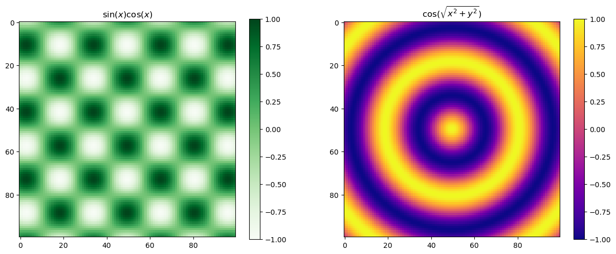
This can can then be used to sample a a grid of \(x\)- and \(y\)-axes. We can use these to give each of the grid points a value and plot this. The plt.pcolormesh() can be easily used to create a colour projection of a 3d plot. A colour map (cmap keyword) is used to specify what colours are mapped to by each value.
def f(x, y):
    return np.cos(np.sqrt(x**2 +y**2))

def g(x, y):
    return np.cos(x) * np.sin(y)
xs = np.linspace(-10, 10, 100)
ys = np.linspace(-10, 10, 100)

Xmesh,Ymesh = np.meshgrid(xs, ys)
Zmesh0 = g(Xmesh,Ymesh)
Zmesh1 = f(Xmesh,Ymesh)

fig, ax = plt.subplots(1,2, figsize=(15,10))

im0 = ax[0].imshow(Zmesh0, cmap = 'Greens')
im1 = ax[1].imshow(Zmesh1, cmap = 'plasma')
fig.colorbar(im0, ax=ax[0], shrink = .56)
fig.colorbar(im1, ax=ax[1], shrink = .56)

ax[0].set_title('$\sin (x) \cos (x)$')
ax[1].set_title('$\cos ( \sqrt{x^2 +y^2} )$')

im0.set_clim([-1,1])
im1.set_clim([-1,1])

plt.show()
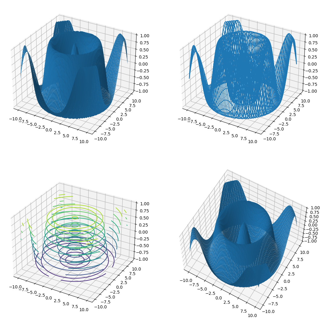
2.5.3 Plotting a Surface#
A surface can be plotted in different ways using .plot_surface(), .plot_wireframe(), or .contour3D() attribute function. We can change the view angle on the plot using .view_init() by specifying the azimuthal angle azim and the angle of elevation elev in degrees.
xs = np.linspace(-10, 10, 100)
ys = np.linspace(-10, 10, 100)

Xmesh,Ymesh = np.meshgrid(xs, ys)
Zmesh = f(Xmesh,Ymesh)

fig = plt.figure(figsize=(13,13))

ax1 = fig.add_subplot(2, 2, 1, projection='3d')
ax2 = fig.add_subplot(2, 2, 2, projection='3d')
ax3 = fig.add_subplot(2, 2, 3, projection='3d')
ax4 = fig.add_subplot(2, 2, 4, projection='3d')


ax1.plot_surface(Xmesh,Ymesh,Zmesh)
ax2.plot_wireframe(Xmesh,Ymesh,Zmesh)
ax3.contour3D(Xmesh,Ymesh,Zmesh)
ax4.plot_surface(Xmesh,Ymesh,Zmesh)
ax4.view_init(azim=-60, elev=60)

plt.show()
2.5.4 Interactive backends#
In IPython there exists a magic function, %matplotlib, that allows the us to specify the backend for matplotlib. So far we have only been using the default %matplotlib inline. For some applictaions it can be useful to use %matplotlib notebook which allows interactivity and evolution in time. You always need to be mindful to ‘turn off’ the image when you are done interacting with it.
%matplotlib notebook

import numpy as np
import matplotlib.pyplot as plt
We can mess around the the below image.
fig = plt.figure()
ax = fig.add_axes([0.1,0.1,.8,.8])

x = np.arange(.1,10,.001)
y1 = 1/x + 3*np.sin(x*100)

ax.plot(x,y1)
ax.set_xlim(2, 4)

plt.show()
y2 = 1/x + 3*np.cos(x*100)

ax.plot(x,y2)

plt.show()
To deactivate the interactive mode and return to static images use:
%matplotlib inline
2.5.5 Animations#
To do animations we need a function, FuncAnimation().
from matplotlib.animation import FuncAnimation
This function takes in a number of arguments that are required.
We need a figure fig, that needs animating with an axis ax. We will do the usual setup.
fig_anim = plt.figure()
ax_anim = fig_anim.add_axes([.1,.1,.8,.8])

ax_anim.set_xlim(0, 2)
ax_anim.set_ylim(-2, 2)
ax_anim.grid()

plt.show()
Now keeping this active we will add a plot to the picture.
The FuncAnimation() function requires an initialise function (the init_func keyword will be used) that will be called at the start of the animation. We will use the .set_data() which gives the data for the curve in the form of two arrays.
We will also need to define an other function that will be called repeatedly. This will change the data in our plot in each successive calling of the function. This function will take in a frame number, i, as an argument. This will be used to change the data in the plot.
Notice that when we plot we have saved the return line item. The , is present because this is in ax.plot() will in fact return a tupple with the needed item as the first item.
def init():
    x = np.linspace(0, 2, 1000)
    y = np.sin(2 * np.pi * x)
    line.set_data(x, y)
    return line,

def animate(i):
    x = np.linspace(0, 2, 1000)
    y = np.sin(2 * np.pi * (x - 0.01 * i))
    line.set_data(x, y)
    return line,

ax_anim.set_xlim(0, 2)
ax_anim.set_ylim(-2, 2)

line, = ax_anim.plot([], [])

anim = FuncAnimation(fig_anim, animate, init_func=init, frames=100, interval=20, repeat_delay=300, blit=True)

plt.show()

plt.show()
The FuncAnimation() can now be called with added keywords
frames: Number of frames long animation will be.interval: number of milliseconds inbetween frames.repeat_delay:blit: IfTruewill not replot parts of lines that are already plotted so it will animate faster.
To save an animation we need a writer. We will import matplotlib.animation.PillowWriter() to do this.
from matplotlib.animation import PillowWriter

mywriter = PillowWriter(fps = 30)
Finally we save the animation.
anim.save('my_animation.gif', writer = mywriter)
2.6 Standarizing Plot aesthetics for publication#
When making plots for publication it is often desirable to have a consistent look and feel across all the plots. This can be achieved by setting the rcParams in Matplotlib. This is a dictionary that contains all the default settings for Matplotlib. We can change these settings to our liking and save them to a file. This file can then be loaded in any script to set the defaults to our liking.
import matplotlib.pyplot as plt
# Set some example rcParams
plt.rcParams['figure.figsize'] = (8, 6)
plt.rcParams['axes.titlesize'] = 16
plt.rcParams['axes.labelsize'] = 14
plt.rcParams['xtick.labelsize'] = 12
plt.rcParams['ytick.labelsize'] = 12
plt.rcParams['legend.fontsize'] = 12
plt.rcParams['lines.linewidth'] = 2
plt.rcParams['lines.markersize'] = 6

# Save the rcParams to a file
plt.rcParams.save('my_rcparams.rc')

# To load the rcParams in another script
plt.rcParams.load('my_rcparams.rc')
Table with some useful rcParams can be found here.
Summary table with most common rcParams:
rcParam |
Description |
Example Value |
|---|---|---|
figure.figsize |
Default figure size (width, height) |
(8, 6) |
axes.titlesize |
Font size of the axes title |
16 |
axes.labelsize |
Font size of the x and y labels |
14 |
xtick.labelsize |
Font size of the x tick labels |
12 |
ytick.labelsize |
Font size of the y tick labels |
12 |
legend.fontsize |
Font size of the legend |
12 |
lines.linewidth |
Default line width |
2 |
lines.markersize |
Default marker size |
6 |
axes.spines.top |
Whether to draw the top spine |
False / True |
axes.spines.right |
Whether to draw the right spine |
False / True |
axes.spines.left |
Whether to draw the left spine |
True / False |
axes.spines.bottom |
Whether to draw the bottom spine |
True / False |
Exercise 1:#
Using Matplotlib, create a 3D surface plot of the potential energy surface of a quantum harmonic oscillator. Follow these steps:
Create a mesh grid for \(x\) and \(y\) values ranging from -5 to 5 with a step size of 0.1.
Define a function to represent the potential energy surface of a quantum harmonic oscillator, \(V(x, y) = \frac{1}{2}m\omega^2(x^2 + y^2)\), where \(m\) is the mass and \(\omega\) is the angular frequency. Use \(m = 1\) and \(\omega = 1\) for simplicity.
Calculate the potential energy values over the mesh grid.
Create a 3D surface plot of the potential energy surface using Matplotlib. Label the axes and add a title to the plot.
Solution here!
import numpy as np
import matplotlib.pyplot as plt
from mpl_toolkits.mplot3d import Axes3D

# Step 1: Create a mesh grid
x = np.arange(-5, 5.1, 0.1)
y = np.arange(-5, 5.1, 0.1)
X, Y = np.meshgrid(x, y)

# Step 2: Define the potential energy function
m = 1  # mass
omega = 1  # angular frequency

def V(x, y):
    return 0.5 * m * omega**2 * (x**2 + y**2)

# Step 3: Calculate the potential energy values
Z = V(X, Y)

# Step 4: Create a 3D surface plot
fig = plt.figure(figsize=(10, 7))
ax = fig.add_subplot(111, projection='3d')
surf = ax.plot_surface(X, Y, Z, cmap='viridis', edgecolor='none')
ax.set_title('Potential Energy Surface of a Quantum Harmonic Oscillator')
ax.set_xlabel('X-axis')
ax.set_ylabel('Y-axis')
ax.set_zlabel('Potential Energy V(x, y)')

fig.colorbar(surf, shrink=0.5, aspect=5)
plt.show()
Exercise 2:#
Using Matplotlib, create a heat map to visualize the probability density of a 2D quantum harmonic oscillator. Follow these steps:
Create a mesh grid for \(x\) and \(y\) values ranging from -5 to 5 with a step size of 0.1.
Define a function to represent the ground state wavefunction of a 2D quantum harmonic oscillator, \(\psi(x, y) = \left(\frac{m\omega}{\pi\hbar}\right)^{1/2} e^{-\frac{m\omega}{2\hbar}(x^2 + y^2)}\), where \(m\) is the mass, \(\omega\) is the angular frequency, and \(\hbar\) is the reduced Planck’s constant. Use \(m = 1\), \(\omega = 1\), and \(\hbar = 1\) for simplicity.
Calculate the probability density \(|\psi(x, y)|^2\) over the mesh grid.
Create a heat map of the probability density using Matplotlib. Label the axes and add a title to the plot.
Solution here!
import numpy as np
import matplotlib.pyplot as plt
from mpl_toolkits.mplot3d import Axes3D

# Step 1: Create a mesh grid
x = np.arange(-5, 5.1, 0.1)
y = np.arange(-5, 5.1, 0.1)
X, Y = np.meshgrid(x, y)

# Step 2: Define the ground state wavefunction
m = 1  # mass
omega = 1  # angular frequency
hbar = 1  # reduced Planck's constant

def psi(x, y):
    prefactor = (m * omega / (np.pi * hbar))**0.5
    exponent = - (m * omega / (2 * hbar)) * (x**2 + y**2)
    return prefactor * np.exp(exponent)

# Step 3: Calculate the probability density
Z = np.abs(psi(X, Y))**2

# Step 4: Create a heat map
plt.figure(figsize=(8, 6))
heatmap = plt.pcolormesh(X, Y, Z, shading='auto', cmap='viridis')
plt.colorbar(heatmap, label='Probability Density |ψ(x, y)|²')
plt.title('Probability Density of 2D Quantum Harmonic Oscillator Ground State')
plt.xlabel('X-axis')
plt.ylabel('Y-axis')
plt.show()